Tuesday, 1 January 2013

Introduction

Welcome to my design scrapbook. I put this together for one of my 2012 publishing course requirements.

There are several ways to read this scrapbook:

  1. Start from the first post and click 'newer post' at the bottom left to view the scrapbook in chronological order from oldest to newest.
  2. Use the menu to the right to navigate by clicking on the post you want to see (if you click on the month you want, the menu will expand to show all the entries from that month).

I've thoroughly enjoyed pulling together this scrapbook. Happy viewing!

This blog is now semi-abandoned; I now blog here: http://nzbooklover.wordpress.com

Saturday, 20 October 2012

I see what you did there


Really? I have to admire the sheer audacity of this cover design. What I find particularly amusing about it is that it's clearly a cash-in on the mega success of Fifty Shades of Grey, but it's invoking Twilight with it's cover art/layout. It seems like both an acknowledgement of Fifty Shades of Grey's fanfiction origins and a dig at the abusive undertones of Twilight.

Monday, 20 August 2012

Fifty Shades of Grey Cover Trends

So, design scrapbook is officially over, but I couldn't resist making a post about about this. It's insane. Actually insane. Look at this:
We have books clearly cashing in on the Fifty Shades of Grey craze advertising this through echoing the design of Fifty Shades of Grey, which in turn cashed in on the Twilight craze, blatantly mimicking cover elements from that series. It's like the book cover version of Matryoshka dolls!

Saturday, 7 July 2012

Dictionary goodness

Today I decided to see how a physical dictionary compared with the electronic dictionary on my kindle. For this extremely scientific test, I decided to give the hardcopy dictionary the best chances possible, so I recruited my brother to use the kindle (as he's never used one before), and I used the hardcopy dictionary. The only hardcopy dictionary floating around was an old dictionary, this one to be specific:
It has one very handy feature, namely these indented 'steps' that make it easy to quickly find a particular section:
The kindle, in comparison, comes with a built-in dictionary. Once you've opened it, all you need to do is start typing in the word. Like so:

So let's see how the two compare (the times are in seconds):
I've highlighted the winner for each word. Initially my brother's inexperience with the kindle made him slower than the dictionary, but he very quickly became familiar with it, and after that there was no beating him. What's surprising about this result is not that the kindle was faster, but that the physical dictionary is not very much slower (I suspect those in-built indents help a lot). With a larger dictionary, the speed difference would of course increase substantially.

Layout-wise, the hard-copy dictionary is much more aesthetically pleasing, but the kindle layout is less cramped as it doesn't have to fit multiple definitions on each page.

By far the fastest and easiest electronic dictionary to use, however, is the online one. The search box is easy to find, and you can quickly type in words using the keyboard.
Once you've found your word, you get a lot of information, but it's very easy to navigate. To the right a box pops up with related words that you might be interested in.

Textured children's book


Here's a twist on an old classic with Hairy Maclary and Friends: a Touch and Feel Book.

Each page of this book has a textured element, clearly designed to appeal to very young children. This tactile experience is also something that can't be simulated by an ebook.

Because of the extra physical material glued into each page, the pages are very thick and board-like, also suitable for young children who may not have the fine motor skills to be gentle with thin pages.


Wednesday, 4 July 2012

Another oddly sized book

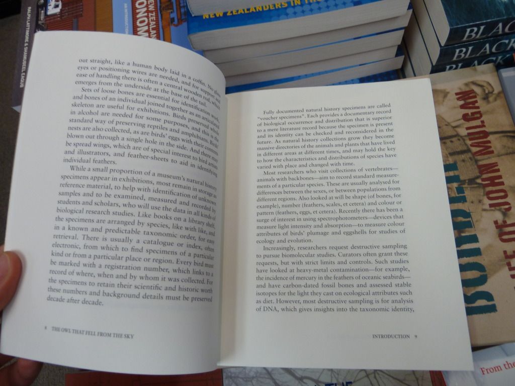
Here's Awa Press' The Owl that Fell from the Sky. The very first thing I noticed about it was its odd size - it's approximately the height of an A-format paperback, but much wider ( 170 x145mm), giving it an almost square appearance.

Aside from the format, the cover design is lovely with a simple black/white/teal colour palette. The only part I question is what appears to be a strange ligature between 's' and 't' - it distracts from the otherwise clean-cut nature of the cover design.


Looking at a page-spread, the margins have been chosen to create a text panel with relatively traditional proportions, rather than the square-ish proportions of the book. This measure works well, without needing too many hyphens (I can't actually see any on this page-spread). I also note the use of the em rather than en dash - this seems appropriate, as the em dash is slightly more old-fashioned, and this book is about museum specimens.